Hello, My name is Andy Wood. I work for Surly Bikes. You are probably thinking what kind of crazy weird shit am I going to show you this time. Well, I decided to take a break from my groundbreaking videos and show you a project that is a bit more serious while keeping the Surly fun. As you know we do a print catalog every year that features almost all the information you need to know about our products. As a graphic designer I look forward to this project every year. I actually look forward to all Surly projects. This place is fun as hell. Even though I am capable of designing things that are so tight and rigid you could skin a coon with them, Surly jobs are quite the opposite. We have standards but our standards are loose and organic. That’s what makes working for Surly unique and fun.
This year’s catalog featured some of the most ambitious artwork I have ever done and it all started on a picnic table. Most of the work I do is done on the computer. Towards the end of this project I used the computer to scan the in artwork and change the colors but 90% of the job was handmade. I have a huge appreciation for hand carved woodcut printing and wanted to give it a shot for this project. Actually I've made lots of linoleum prints in the past but never with wood.
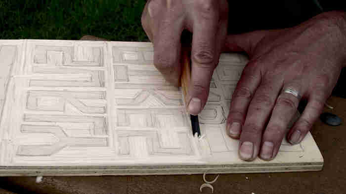
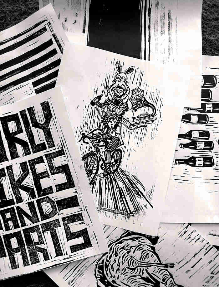
At our Surly camping retreat I brought along a small slab of ply wood and my carving tools. After staring at the blank slab for hours not knowing what to draw, I decided to make some blocky letters that read Surly Bikes and Parts. Pretty original I know. This is how it all began. One thing to note is that you actually have to draw in reverse so when you print, so it reads the correct way. Kind of challenging to draw letters backwards.
Once I got home from the retreat I was anxious to ink this bad boy up and see how it printed. Most woodblock printers use an oil based ink. I used a water based one that was leftover from my litho printing days. It does not print as well because it soaks into the wood a bit but is easy to clean up.
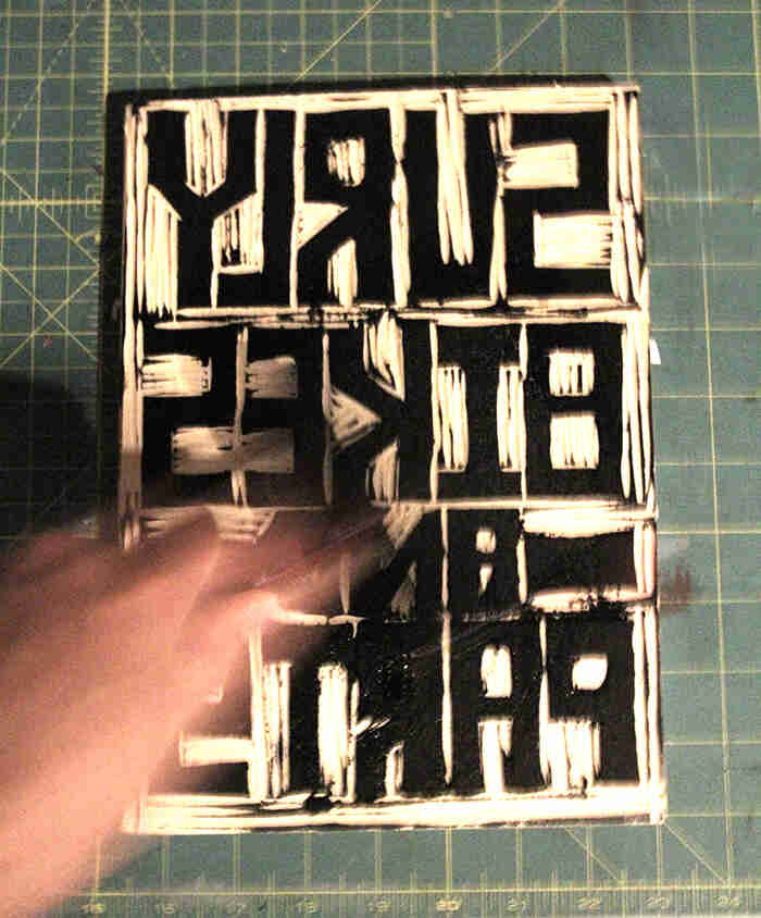
It takes lots of tries to get the perfect print, plus I wanted to use up my ink.
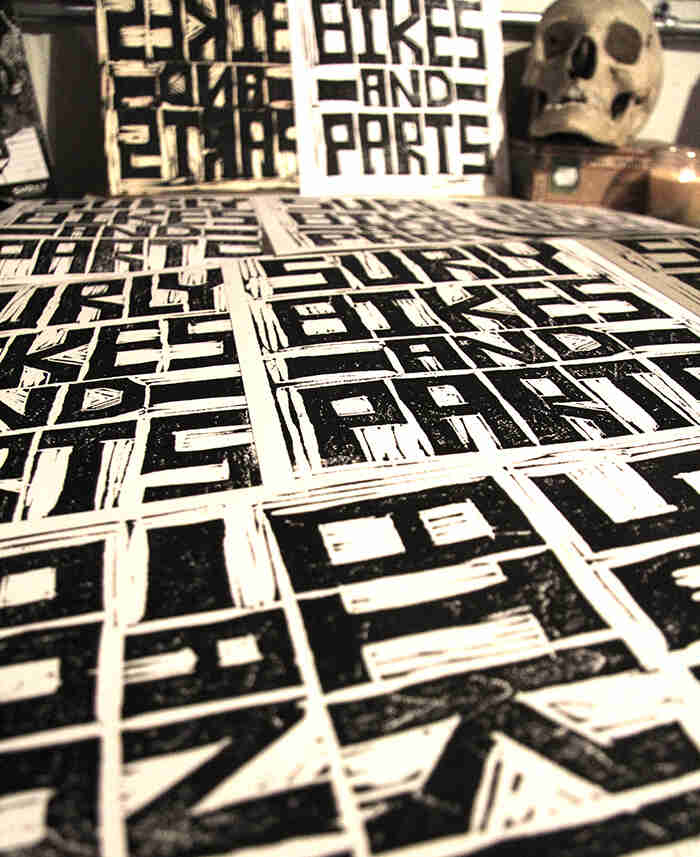
I didn’t want to stop at just carving the words so I decided to make woodcuts for several other parts of the catalog. For the cover I wanted to use the words as a background image, and then have a second woodcut print over the top of that. That would be the picture of the clown riding the Straggler with the monkey on his back and his little rabbit buddy. This illustrates the fun and chaos we deal with on a daily basses. Next step was to scan all these into the computer then colorize and design. In addition to using the woodblock letters on the cover, I created the alphabet and numbers then had a local font maker create a custom font for us that we used throughout.
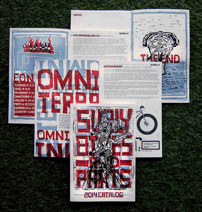
Finally you can see all the different pieces of art integrated into the catalog. Historically we’ve always made a black and white catalog and we still kind of do, however last year and the year before we used black and an additional color. This year in order to pull off these designs we went with black and two other colors. You might say to yourself, "I want to see what colors your bikes are." Well, go to our website and you will.
I hope you get a chance to see the catalog in person. It's not only a great resource that was put together by our amazing team of talented bike nerds; it's also neat to look at.
About Wood
Andy Wood is a nifty height, five feet twenty inches. In his spare time, he farms and harvests fat beats on his high tech home computer. He hails originally from Durango, Colorado, where he rode mountain bikes and skied cross country, both of which he still does. He is Surly’s art director, and as such is responsible for balancing Surly’s more pragmatic pursuits, like the use of charts, with pathologically creepy and weird shit, like abandoned dolls. He is one of the three Andys who work here and is a founding member of Andyland.
 Surly Bikes